Valorant is the new game from Riot Games, released in early June after a beta phase of just over two months. For now, this FPS features four different and unique maps: Split, Haven, Bind and Ascent.
The development team, through Chris "Danger Boy" Carney and Sal "Volcano" Garrozo, has just published a post about the process that led to the creation of Split.
Where did the Split come from and how did we bring it from a loose, rough idea to a polished launch experience?
The design philosophy behind our maps on VALORANT is relatively simple. We have a wide range of characters with an array of abilities who can also wield a multitude of weapons. Instead of trying to create maps that all provide an equal number of ideal combat situations for the crazy number of permutations, we instead push each map in a specific direction.
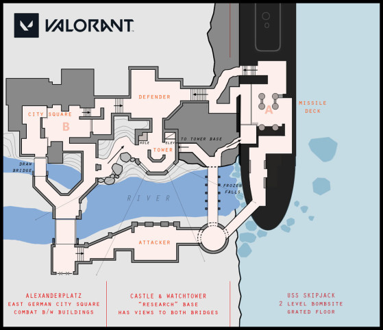
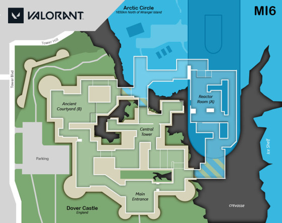
For example, on Bind we ask “what if we remove the middle area of the map (i.e. “Mid”), which typically provides flanking opportunities on a traditional two objective map?” How would that affect the way five-player teams play defense or how they attack? Can we even build a map that works well with this constraint? This becomes the design goal of the map.
The intent here is not to have a “gimmick” for each map, but instead to center the map around a specific gameplay experience that we can create with the map geometry. We also evaluate new map mechanics, such as one-way teleporters or ascenders, and see how these can help us achieve this goal.
With a clear target, we are then able to evaluate if this type of experience works well for VALORANT. If the map does not play well when we start playtesting, we can determine if we are just executing on it poorly or if our goal is wrong for the game. However, if it’s working well, we can then focus on how to make it better. Each map becomes a new challenge for players to solve. This creates gameplay diversity within our map roster while allowing certain characters and team compositions to shine.
As you can imagine, it doesn’t always work out. There are greybox levels (a “greybox” is our earliest playable version of a map) that will never see the light of day. On the other hand, some levels have withstood the test of time and have gone through literally years of iteration to earn a spot on our final roster.
Split is one of these experiences.
The build
For Split, the question focused on whether or not we could create an off-site position that was essential to defending or capturing each site. To put it even more simply, could a tactical map play like King of the Hill?
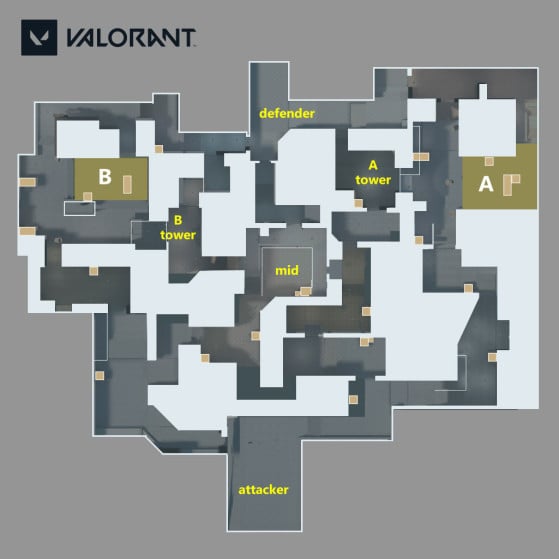
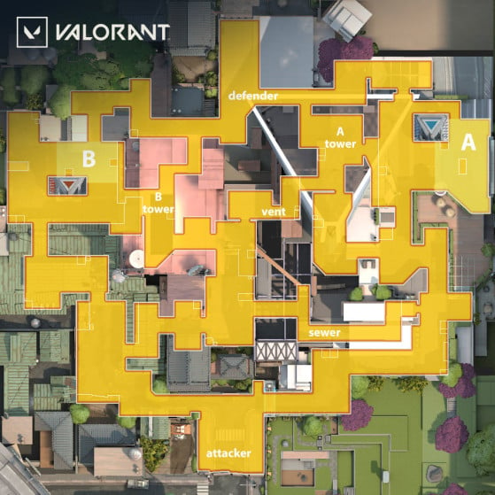
The original design had a single tower in the center with bullet proof glass that allowed Defenders to see the approach of the Attackers. During playtesting, we found that the tower did indeed provide an off-site position that was critical to hold, but it was too powerful and pulled too much combat away from the objective sites themselves. So we decided to break the tower into two smaller towers that focused on each site.
The next version pushed more of the action to the objective sites with Mid giving players access to the new smaller towers. Instead of looking at Attacker spawn, these two spots overlooked each objective site and provided strong overwatch as Attackers or Defenders. It started creating unique gameplay opportunities that worked well within the game. Taking a tower helped Attackers take the sites.
We were onto something! However, Mid was still too critical and the overwatch positions were also too disconnected from the sites themselves.
The third major revision firmly connected the towers to the sites which allowed them to be a core part of the combat around the objectives. Players could jump out of the towers onto the sites and use ladders to travel in the reverse direction. While these elements worked well, Mid unfortunately had become a large, porous mess of connections and was still the main hotzone on the map. We had some work to do.
The best solution was to break Mid into two halves and then connect these directly with hallways, which became the “Vent” and “Sewer” that you experience today. This allowed us to divide Mid combat into focusing on attacking and defending each tower. In addition, we further crafted the objective sites where ignoring control of the tower would make holding the site itself more difficult. Our goal of creating off-site positions that were essential to each site was working.
We finally had something that the team was excited about and it was time to move the map into Art Production.
Making it real
While Split was undergoing all of these revisions, VALORANT had moved through several thematic directions and was now focusing on locations inspired by real places on Earth. The foundation of VALORANT’s combat model has always focused on tactical shooting using real world weapons with a few spectacular moments punctuated by the use of abilities. We wanted the world to reflect this as well.
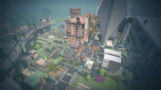
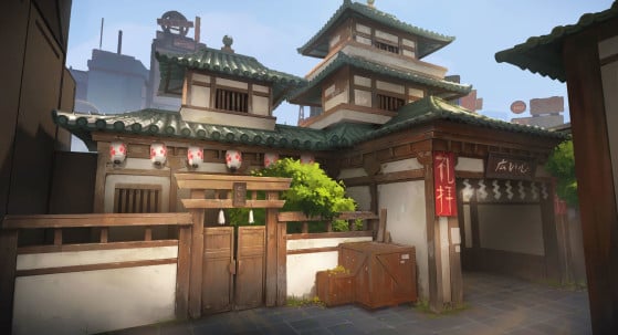
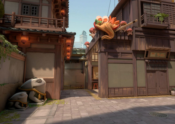
Split was now a Japanese city under a dramatic transformation as Kingdom transformed the daily lives of everyday citizens while increasing its footprint. This new direction provided city courtyards and alleys that would match up well with the layout of the map, while also adding a few futuristic moments of spectacular goodness. The Map Art team then went about creating an incredible old world city that lives under the shadow of a massive Kingdom R&D facility.
Since we always want our art to help clarify gameplay, and each area around the towers and objectives needed to be clearly memorable, we divided up the map into two distinct sectors. B Site was to be the older district in the city, while A Site was to be part of an ever expanding, new Kingdom tech campus. Each part of the city would also be anchored around a Raidanite Generator which would identify the objective sites.
Cities can be visually overwhelming and player orientation and navigation are always critical. We want players executing strategies and fighting enemies rather than fighting the layout of the map. By separating the map into two distinct visual themes we were able to generate unique places of interest (POIs) that complemented each side of the city. These POIs are critical to the design of any map and, along with a clean composition of space, help players build an easy mental map of how the places connect.
In the end, Split was released and we continue to refine these ideas with the help of players. Patch 1.0 included further revisions to the Mid section connecting to B tower and we will still be watching and evaluating how everything is working.
Look for more stories about the maps in our launch roster in the future. Meanwhile—see you in the city!
