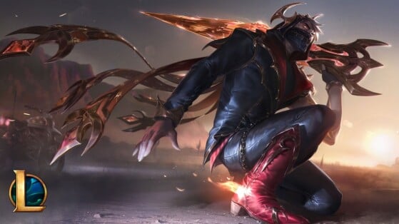
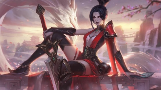
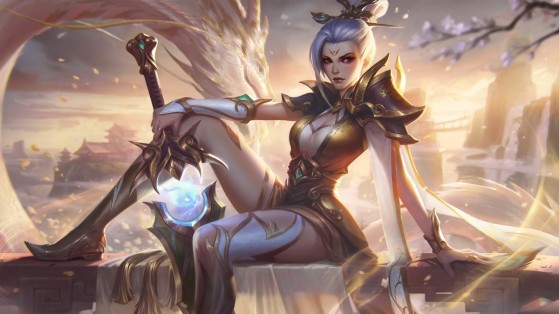
One of the big changes Riot Games made to League of Legends cosmetic content was with the new Prestige skins. The developer listened to the community's criticism of these skins which, while not a flop in terms of sales, were some of the most controversial in the community. There are still tensions over the style or the number of modifications to be made to these skins, but where the developers have put the most emphasis is on the illustrations whose inspiration has surprised fans and, again once, divided them.
League of Legends turned into a fashion ad
Riot Games had announced that the new Prestige 2.0 skins would be high fashion versions of the base theme and that it would treat them as if they were the clothes the chosen characters would wear on the red carpet of an awards show in the universe in which cosmetics are located . What no one expected is that they take this framework so seriously, as it's clear that the company took inspiration from fashion marketing classics when creating the artwork for these skins.
Although there are exceptions, most fashion brands use minimalist sets, without too many elements, to try to make their new clothes stand out more. The goal is that the background of the image is not predominant to create a composition focused only on fashion. It is a way of directing the viewer's gaze that is widely used in marketing. This is of course one of the oldest tricks of advertisers, but it is still used because it is extraordinarily effective and now it has come to League of Legends with this rework of Prestige skins.
Interestingly, Riot Games has used this technique before. Although the illustrations of skins and champions have more and more details to take up the whole image, if we look at cosmetics or characters released some time ago, we can see them turned sideways or in frames without too many additional elements. Of course, the developers back then didn't do it with that intent, nor did they have the same finesse in execution. In fact, splasharts are one of the things that has evolved the most since launch without the community noticing.
Although this was a well-founded design decision and a lot more work than the old illustrations for the prestige skins, which only changed colors, this change was not welcomed by all. the world.
Some players see it as a lazy decision and feel the backgrounds are too empty, in a way that doesn't do justice to what should be some of League of Legends' most unique cosmetics . Additionally, the skins have the worst like ratings (they can still be viewed with browser extensions) from YouTube channels that feature the cosmetics.
