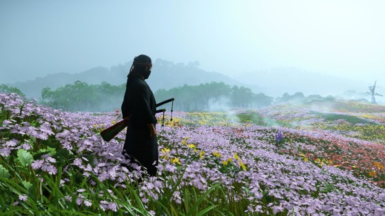
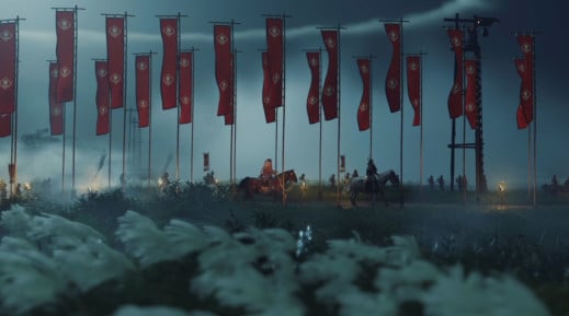
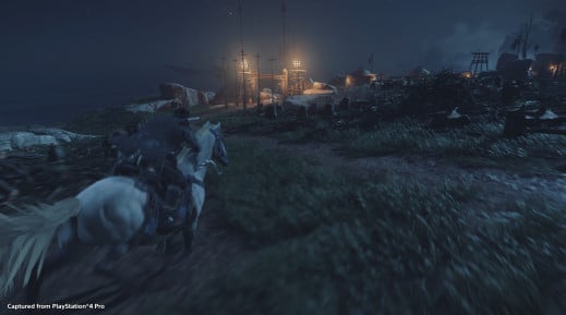
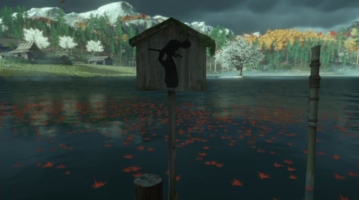
A new feature in Ghost of Tsushima has gone viral on social networks. The artistic masterpiece from Sucker Punch has just received a new update, which includes an extension of the plot, but it's a camera adjustment that's getting all the attention.
In the viral clip, you can clearly see that any objects blocking the view of the main character are no longer an issue, avoiding obstruction of the gameplay experience.
For example, moving behind a tree will see that tree become transparent, allowing you to keep playing without having to worry about manipulating the camera.
Opinion seems to be split on social media. Some are saying that it is "ugly and old", while others suggest it is "revolutionary and practical".
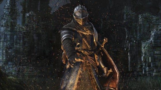
The truth is that this type of situation has been a headache for developers since time immemorial. Camera angles have always weighed down the experience, especially in games with active combat or when the action takes place in enclosed spaces. Dark Souls is a classic example of this, and has frustrated players endlessly.
While this transparency technique isn't exactly new, everyone is talking about it.
Many creatives have spoken in public about how to face this design challenge. Mark Haigh-Hutchinson, Senior Engineer at Retro Studios, has spoken about the fundamentals of designing a camera in real time.
One of the points he delves into concerns the process when it comes to avoiding visual effects that hinder the experience and facilitate the playability and immersion to the user, providing a solution for this endemic design evil -- such as that seen in the viral video in question.
"If the plane near the trunk of the camera's view intersects the rendering geometry, it will produce unwanted visual artifacts. These certainly detract from the game's graphical quality and, at best, will seem a little unprofessional."
"This problem is completely avoidable; it should be considered simply unacceptable in modern camera systems. An acceptable solution to avoid this problem is to apply transparency effects to the geometry in question. By effectively removing the geometry - and in fact doing it in accordance with the proximity of the camera - the camera can be allowed to pass without creating distracting visual artifacts."
We highly recommend the video entitled The Challenge of Cameras from Game Maker's Toolkit, where they explain that the camera should serve the gameplay.
Another example or solution is mentioned in the video 50 Game Camera Mistakes by John Nesly, camera designer for hit indie title Journey by thatgamecompany. In it, he discusses programming secrets and the decisions made by the developers so that the use of this key element be optimal.
In the video, he says that the obstacles hindered the camera in the game, leading them to make the decision to go through the element in question -- so that the camera would get closer to the character.
This is a measure that we have also seen in other games. In this case it depends a lot on the adventure style for the decision to be made. In games that have more action, bringing the camera closer breaks the essence and makes the user uncomfortable knowing where the enemies are.
It is one of the endemic problems of Souls-like games or other types of adventures, such as platform games.
There is never an ideal or a perfect solution, as tastes are varied. But you have to value the work of creatives when looking for efficient solutions.
