Photo credit: LoL Esports / Riot Games Korea
As the KeSPA Cup just ended with the victory of the current League of Legends world champions, DAMWON Gaming, it's time for the 10 teams of the brand new franchised league to turn to the LCK Spring Split.
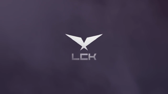
Before unveiling the details of the season (schedule, dates), the league officials unveiled the rebranding of LCK. Out goes the old logo, replaced by a new, much more minimalist design.
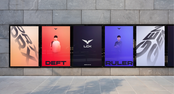
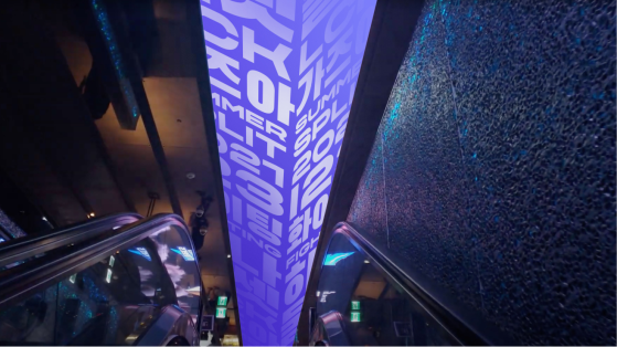
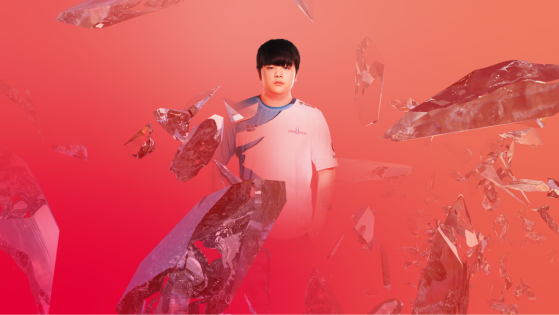
All of the league's visuals were updated to reflect this new artistic line.
"We are the LCK. The original league, proudly the next wave of our sport. Our new brand introduces a confident, contemporary design language that signals a bold new era for our league." said LCK, "Our logo captures the confident, sophisticated spirit of our league. Made up of two simple triangles, it represents the past and the future, two sides of the rift — and the powerful outstretched wings of a bird in flight. Our logo pays respect to the precise angles and star-inspired geometry our historical mark."
The LCK isn't the only one to change its brand identity. FunPlus Phoenix changed its logo, DAMWON Gaming changed its name to DWM KIA, Team Dynamics changed its name to Nongshim RedForce, SANDBOX Gaming now goes by Liiv SANDBOX and hyFresh Blade is now called Fredit Brion.
Looks like we'll have to get used to a bunch of new visuals and names for this 2021 season.
Original content by "Cthulhu".
