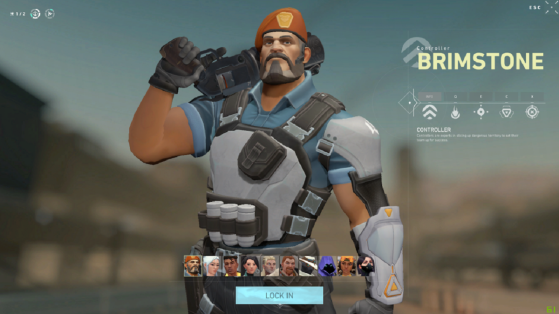
The release of Valorant, the latest game from Riot Games, is fast approaching. This seems to give inspiration to some graphic designers who are already imagining new visuals for the game's UI, including the agent selection screen (which currently looks like the image at the top of the article).
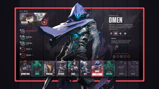
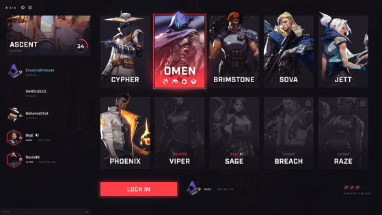
It's a Reddit post featuring two designers, Joey Eckert and Travis Showell, for the quality of their work. They were inspired by the requests of the community, while keeping their own style, to offer a more complete version than the one available in-game. Some players criticized the lack of legibility of the different Agents' abilities.
In addition to this, Eckert's design makes the agent lock more visible. A classic color code using green and red could make it possible to tell at a glance whether the agent you want to play is still available or not. Many players select a character only realizing at the last minute that one of their teammates has chosen it before them.
Howell's version remains a fan favorite for its simplicity and the fact that there are fewer details that can be considered "useless". Even if on the whole these creations have been very well received by the community, judging by the positive comments, it's unlikely that the visuals proposed during the beta will be modified. It mainly allows to dream a little and make the hype grow until June 4.
