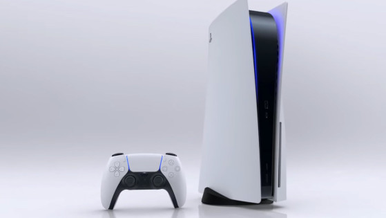
We're on the precipice of an entirely new console generation. In less than a month, we'll be welcoming an entirely new couple of systems: the Xbox Series X and PlayStation 5. When they arrive, in addition to a swath of other changes, one of the biggest things users will need to get used to is each system's UI.
All consoles generally go through several UI iterations over time, but the biggest alterations undoubtedly come in tandem with a new console release. The Xbox Series X and PlayStation 5 will be no different. We've seen a few glimpses at what's expected from both systems’ new menus and navigation already.
But before the consoles are released into the wild and we can delve into some of their individual UIs’ finer points, let's look at what we can expect from each one based on what we know so far.
Here’s a brief preview of what both Sony and Microsoft have planned for the Xbox Series X and PlayStation 5’s UIs.
Overall Layout
Xbox Series X
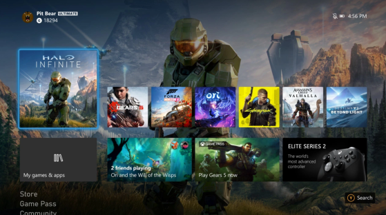
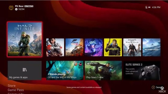
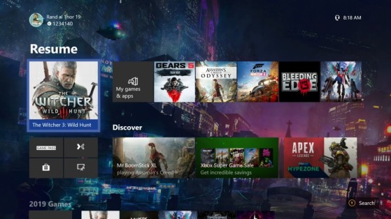
Upon booting up the Xbox Series X, it's clear that a drastic overhaul wasn't something Microsoft had in mind. In fact, Microsoft previously noted that a brand new UI wasn't in the cards -- instead, there would be a series of changes meant to make the experience quicker and more reliable. The overall dashboard and UI resemble the previous iteration as seen on the Xbox One.
Navigation is relegated to multiple tiles, much like choosing apps on Windows 10 PCs. Grid-based options are king, as well as separate panes to explore additional game information. The design attempts to organize key info all in one place to make looking through your personal collection much simpler.
PlayStation 5
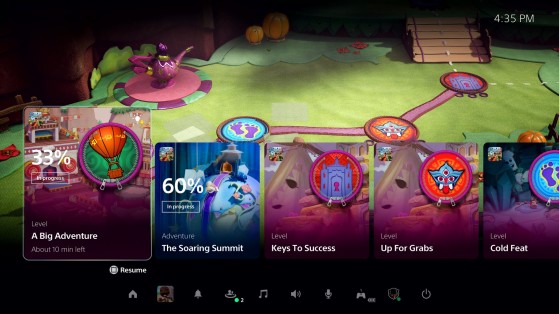
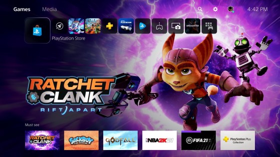
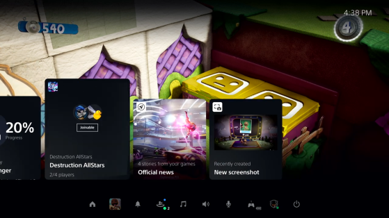
Sony said it will introduce a complete overhaul to its familiar user interface, and released a special video showcasing what it will look like. While much of it remains familiar in terms of what we've seen from PlayStation in the past, there are clearly new alterations that make it seem like a completely different menu.
From pressing the PS button to get started and logging in to choose the user, the new PlayStation 5 experience is more reminiscent of the large tiles on Xbox Series X. It seems as though traditional themes may not be supported either. Out of the two systems, Sony implemented the most changes for its UI.
Games
Xbox Series X
Microsoft has left choosing which game you want to play on your system largely untouched. You still need to navigate to a grid-based lineup of titles that show off what's on your console as well as its origin. If you have it downloaded by way of Xbox Game Pass, there will be a small badge on the game icon.
You can sift through apps and groups you've created in this area, as well as display your entire game library. This is relatively unchanged from the latest iteration of the dashboard as well. It's basically a more polished iteration of what Microsoft has continued to use over the years, but the company made a concerted effort to make things much snappier. The newest dashboard looks to be no exception.
PlayStation 5
The new PlayStation 5 UI treats games much differently than the seemingly endless-scrolling list of titles you could choose from when going to play a game. There's still a "Games" tab that lets you choose what you want to start up, but it's also paired with new full-screen graphics of the titles you're interested in playing as well as "Activities," which are shown as on-screen "cards".
These let you "discover new gameplay opportunities," enter specific levels and start challenges as well as engage with new areas in each game. Some Activity cards are even compatible with picture-in-picture mode so you don't even have to leave the main menu. These changes are a far cry from the normal PlayStation dashboard.
Sharing
Xbox Series X
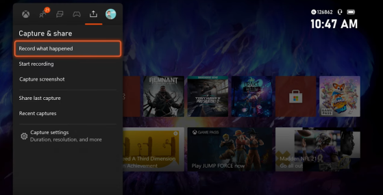
The Xbox Series X dashboard has dedicated options for sharing gameplay with others. These were there in the past, but they seem to be more pronounced with the latest update. You can record what just happened, start a new recording, capture screenshots, share your last capture, and check out recent captures from a sub-menu from the dashboard that you can open from anywhere.
PlayStation 5
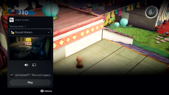
Sony has integrated several ways to share your gameplay in-game. You can head to a special menu to share your screen with other users as well as clips and replays. There's even a new option to go side-by-side with your own screen or picture-in-picture so you can share your journey with friends more easily than before.
Sharing things on the previous PlayStation 4 UI was sluggish, as there was always a bit of a wait between pressing the button and getting access to the menu. It looks like this has changed for a much snappier overall experience.
Additional Content
Xbox Series X
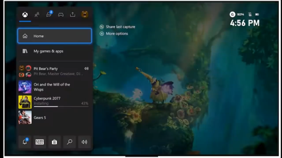
Since we haven't gotten a look at every single thing Microsoft has in store for Xbox Series X owners in terms of the new dashboard (which is coming to the older consoles as well), there are plenty of aspects we don't yet know. However, we do know that there are plenty of other things to do on the dashboard, such as seeing what friends are doing, viewing promotions and offers, and checking out the status of current downloads.
It seems as though this is largely going to be unchanged, just refined and zippier, as previously mentioned. Much of these updates will take place on your screen in the form of a pane to the left when you're ready to pull up your party, current installs, and other actions in an app-like array.
PlayStation 5
Much of what you want to do to interact with others, launch offers or promotions, check the current status of things on your console, and similar interactions can be done straight from the horizontal main menu. There appear to also be shortcuts while playing a game that pop up via the same type of tab that Microsoft implemented for Xbox Series X.
Overall, there are more actions you can take as well, which illustrate just how much Sony has actually changed from the first PlayStation navigation menu on PlayStation 3 (the first iteration of this motif) to now.
